

Box Park North
Heritage and Joy, a Sweet Reunion
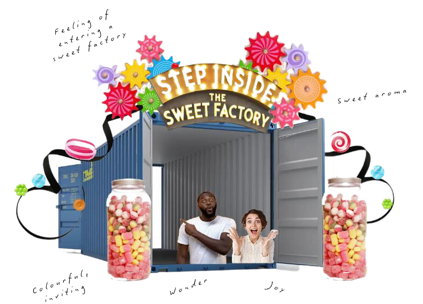
This project explores the initial concept for a pop-up brand experience inspired by BoxPark-style modular container spaces. Designed for the #MadeInYorkshire brand Joseph Dobson & Sons, it creates an engaging, retro-inspired environment featuring oversized sweet sculptures, aimed at university students in Market Place, Huddersfield. Using AR (Adobe Aero), I experimented with layout to enhance the immersive experience.
Additionally, the project involved designing public toilet facilities for Boxpark North, balancing creativity, functionality, and compliance with UK building regulations. The flexible layout accommodated 500 users, incorporating male, female, and gender-neutral toilets, accessible facilities, baby-changing areas, and cleaning amenities. A well-planned entrance and circulation ensured a welcoming and inclusive experience for all visitors.
VIDEO ANIMATION CREATED USING SKETCHUP
STORY BOARD


Disclaimer: The images used for concept inspiration are for reference purposes only and do not represent my original work.

MATERIAL SAMPLE BOARD FOR TOILET FACILITIES
Technical Drawings

FLOOR PLAN

ELEVATIONS AND DETAILS
Concept Development
Part 1 - Heritage and Joy, a Sweet Reunion

Disclaimer: The images used for concept inspiration are for reference purposes only and do not represent my original work.
.png)

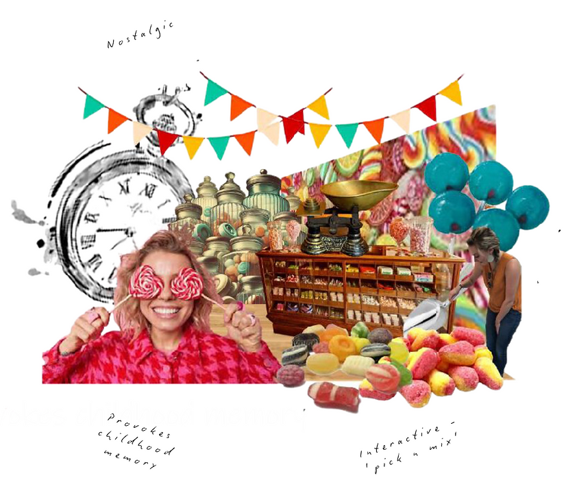
I initially experimented with the placement of sweets within a container model to analyse and refine the customer pathway. Once an optimal flow was achieved, I incorporated collage techniques to introduce depth and gain a 3D perspective, enhancing the spatial understanding of the design.
Part 2 - Flush

Disclaimer: The images used for concept inspiration are for reference purposes only and do not represent my original work.
The planning process began by experimenting with the placement of CAD blocks across various floor plans to assess space requirements while ensuring compliance with Approved Document M and British Standard BS 6465-1.For the baby changing facilities, I aimed to enhance convenience and inclusivity by incorporating a toilet within the space, accommodating parents with multiple young children. Additionally, I integrated a dedicated feeding area to provide privacy and comfort for breastfeeding mothers, creating a welcoming and user-friendly environment.
.png)
.png)
Using four containers provided greater flexibility in positioning the toilet cubicles, but resulted in a large unused space between the toilets and handwashing basins. To address this, I experimented with bringing the wash basins closer; however, this created an expansive open area in the far corner, prompting consideration of seating for users.Further experimentation with the toilet cubicle layout led to continued refinements in the placement of both the wash basins and seating. This iterative process raised key questions regarding the necessity of seating and the most suitable container size for an efficient and user-friendly design.
.png)
To optimise space efficiency and functionality, I decided to use a width of 3 containers, ensuring a more effective spatial arrangement. The wash basins were integrated within the toilet area, while the previously unused corner was utilised for urinals, maximising the use of available space. Additionally, a small seating area was incorporated to enhance visitor comfort and accommodate diverse user needs.
.png)
Disclaimer: The images used for concept inspiration are for reference purposes only and do not represent my original work.
I selected the material palette to reinforce the connection between traditional sweet-making methods and the Boxpark pop-up design. Copper wash basins and exposed copper pipework evoke the traditional equipment used in the confectionery process, while also enhancing the factory-inspired aesthetic. Fluid-shaped basins symbolise the stretching of sugar, adding a dynamic, sculptural element to the space. A concrete-look floor mimics the industrial setting of a sweet factory, grounding the design with a raw feel. Multicoloured tiles pay homage to the accidental creation of the Yorkshire Mixture, adding a playful and nostalgic touch. Striped patterns reference classic sweet packaging, reinforcing the brand’s heritage. Hexagonal tiles reflect the molecular structure of sugar and iridescent tiles, inspired by sugar crystals under a microscope, introduce a shimmering, light-reflecting surface, enhancing visual depth. Dark wood elements draw from traditional shopfront designs, adding warmth and historical character. Colourful pendant lights, resembling falling sweets, capture the essence of the Yorkshire Mixture’s creation. Warm spotlights in toilet cubicles provide a comfortable and inviting atmosphere, enhancing the user experience. Together, these elements create a visually engaging, immersive environment, blending heritage, industry, and playfulness into a cohesive design.